Popona’s original logo came to life without much planning or a deeper design intention. The choice of font was instinctive, and the bright fuchsia color naturally complemented the overall look. After three years, I decided to replace the bold fuchsia with a more calming beige. This was the only visual change I had made to Popona in four years—until now.
The turning point came in September 2023, when my little boss (aka my daughter) started preschool. Suddenly, I had more time to truly dive into the business and realized that for Popona to grow, a refined and thoughtful visual identity would be key. I’m not a fan of impulsive changes that confuse clients, so choosing the right creative agency was crucial.
Thanks to one of my favorite podcasts, MikeOn Podcast, I discovered the inspiring story of the women behind the branding studio Heels Make Deals. A female-led agency with a unique, thoughtful approach immediately resonated with me. Since most of my clients are women, the idea of working with a team that truly understands feminine perspective and detail felt like the perfect match.
My first meeting with Sabina and Kateřina, the studio’s founders, became a defining moment. I was immediately charmed by their energy, vision, and commitment to female empowerment. I shared the entire journey of Popona with them, along with my dreams for its future. Their excitement and genuine understanding of my brand were palpable. I knew I had found true professionals.
The weeks that followed were filled with anticipation. Despite my full trust in Sabina and Kateřina, my inner perfectionist was prepared for the possibility that I might not love every element of their proposal.
But from the very first moment of their presentation, I was completely blown away. Their work captured my vision in a way I hadn’t even articulated. From the logo design to the color palette and font suggestions—everything was in perfect harmony with my taste.
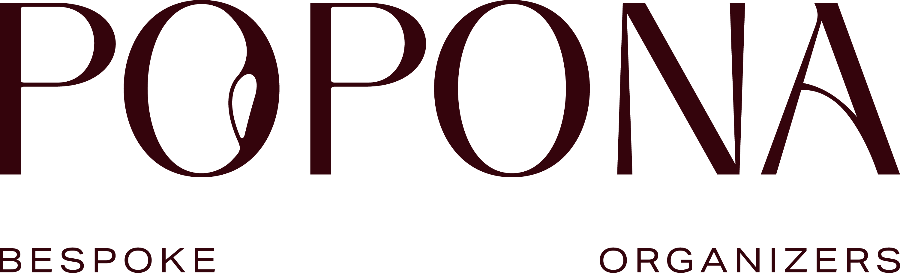
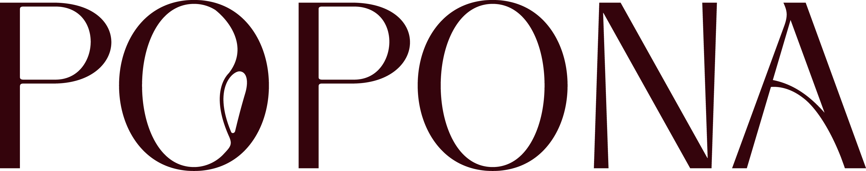
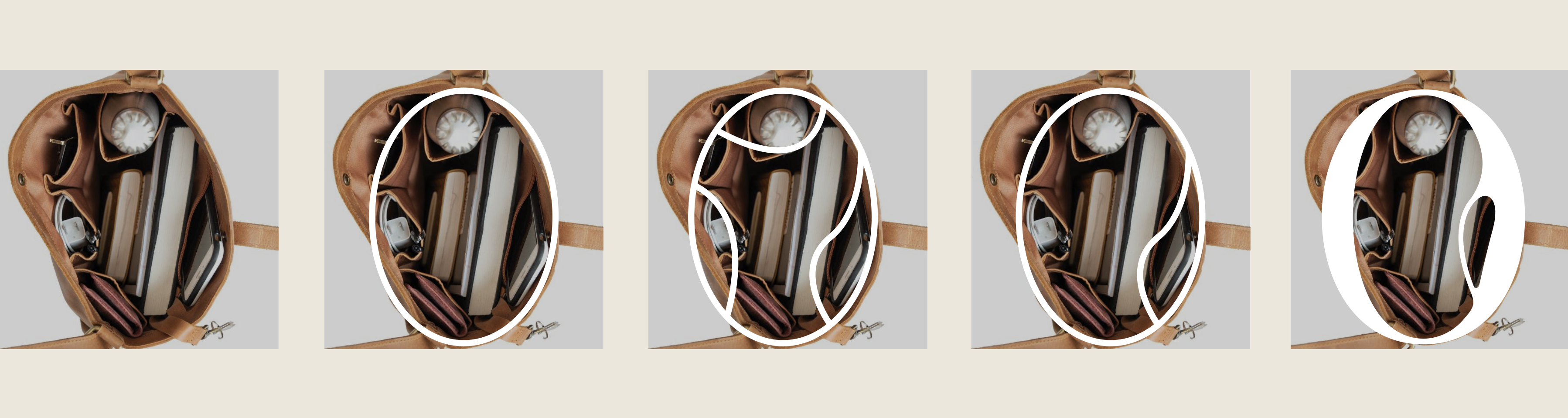
What took my breath away the most, though, was the deeper meaning they brought to the logo. The letter O, now the core symbol of the Popona brand, was inspired by the top-down view into an open handbag with an organizer inside. The subtle design detail within the “O” is not just decorative—it represents the pocket inside the organizer. And as you may already know, Popona means “pocket” in Hawaiian.
From the bottom of my heart, I thank the team at Heels Make Deals for creating a visual identity that finally reflects everything Popona stands for. I’m proud that our branding now tells a story—one that is as unique and intentional as the brand itself.
A story that you are now a part of.
